The Work
Many web designers show an endless scroll of website screenshots on this page. I’d rather describe what I bring to a project, and how it will make your Squarespace website better.
Simplicity
A simple website is: easy to use; more reliable and less trouble to maintain; more communicative and persuasive in its message. In my experience, the best websites are ones that have nothing extraneous.
—Guiding Principle 04 – Less is More
Structure & Hierarchy
Breaking down your message into bite sized chunks makes it easier for people to find information. This leads to a more positive user experience, increased engagement, and better conversion.
—Guiding Principle 03 – Create Purpose
—Guiding Principle 05 – Make it Clear
Clean Layouts
A good layout leads a viewer’s eye to what’s most important. Using the principles of balance, contrast, alignment, and proximity, all of my pages are visually pleasing and easy to navigate.
—Guiding Principle 05 – Make it Clear
—Guiding Principle 06 – Promote Focus
Project Spotlight
-

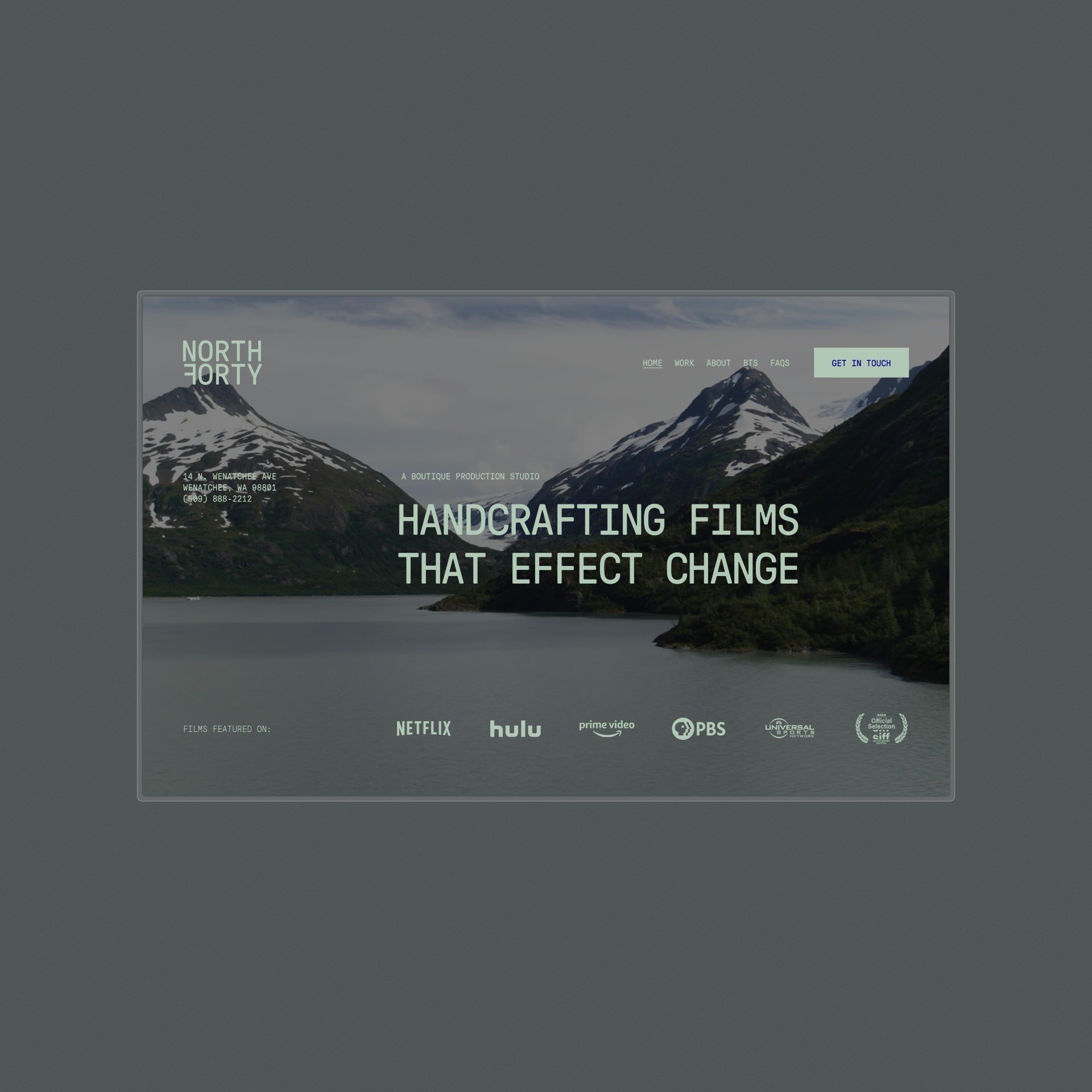
North Forty
Film Production
-

Quang Ho
Artist Painter
-

Bud Stange
Online Apparel
-

Hoop Lab
Sports Training
-

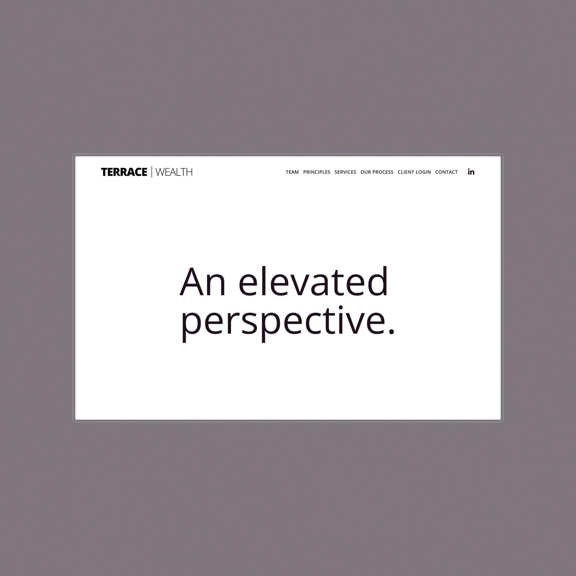
Terrace Wealth
Financial Planning
-

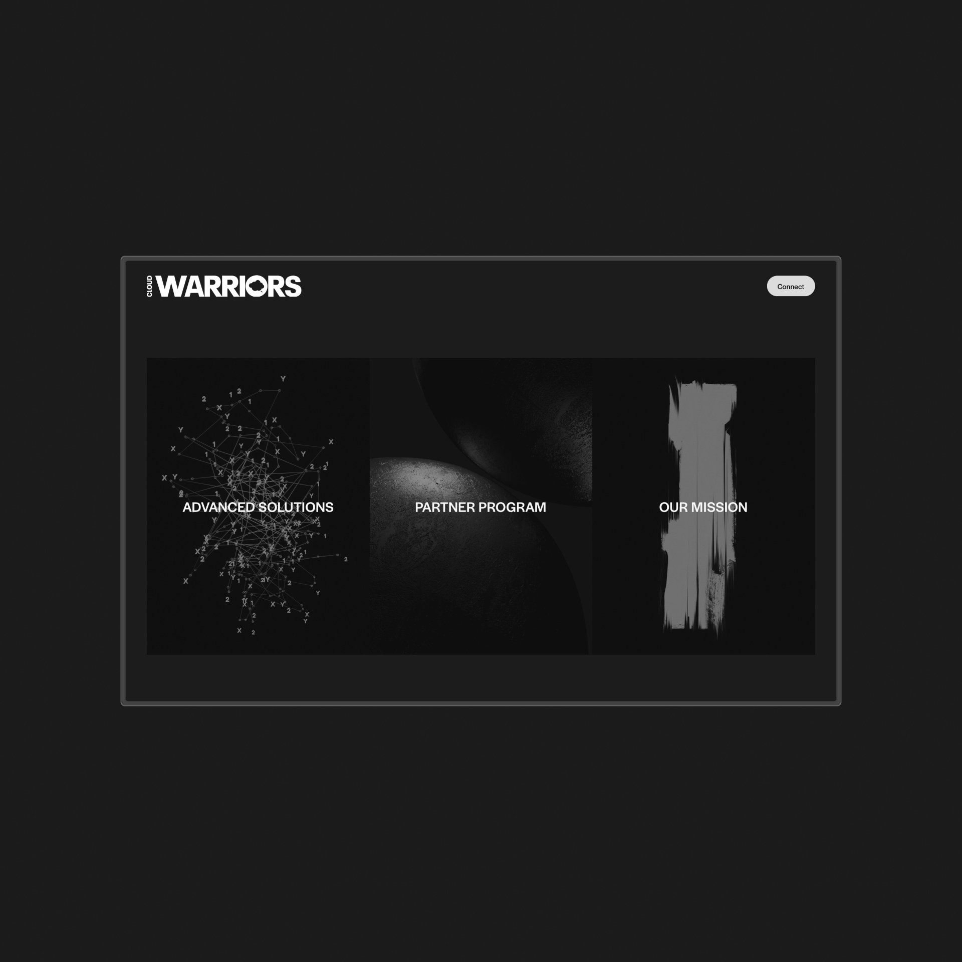
Cyber Warriors
Network Security
-

Bonfire CJ
Fine Art Consultant
-

BDMI Fund
Venture Investor
-

Funded Ventures
Venture Investment
-

Longwave
Band
+25
Designing great websites for nearly twenty-five years.
Twenty-five years of web design has taught me the power of simplicity, the importance of user experience, and the beauty of creative constraint. I've learned to embrace platform limitations and use them to my advantage, creating impactful websites that are visually stunning and easy to use.


